Design concept · Wildlife sanctuary
Carson Springs Wildlife
A 275-acre sanctuary in Gainesville, Florida, funded entirely by tours and donations — and a website that made both of them hard to find.
This is unbuilt work. It is a design concept produced for Carson Springs, not their live site, and the donation flow shown here runs in test mode and moves no money. Their real website is still the one on the left of every comparison below.
- Subject
- Carson Springs Wildlife
- Where
- Gainesville, FL
- Type
- Design concept
- Land
- 275 acres
- Animals
- 100+
The challenge
Everything it needs to say, said last.
- A 501(c)(3) sanctuary whose entire income is tours and donations, on a site where booking a tour and giving money were both several clicks deep.
- Three generic columns — Tours, Upcoming Events, Donations — doing the work that the sanctuary's actual story should be doing. Nothing on the page explained what the place is or why it exists.
- The strongest asset the organisation has is that it is not a zoo. That distinction appeared nowhere above the fold.
Today, and the concept
Four sections, side by side.
Home
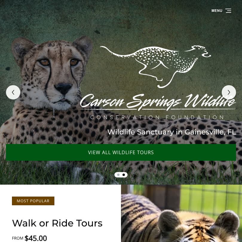
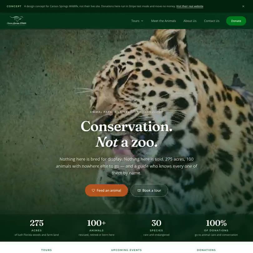
The original leads with a tour price and a carousel. The concept leads with the distinction the whole organisation rests on — a refuge, not an attraction — and puts the four numbers that prove it directly underneath.
Why it exists
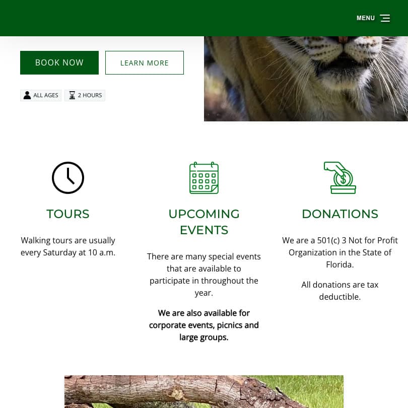
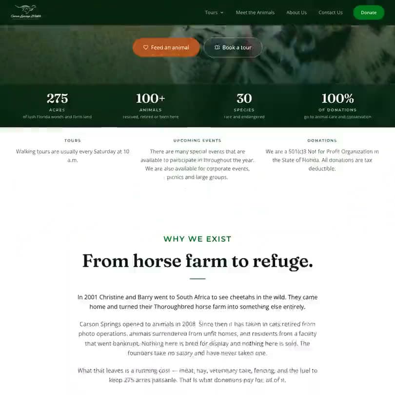
Three icon columns labelled Tours, Upcoming Events and Donations become the sanctuary's actual origin story. Donors give to organisations they can picture, and an icon is not a picture.
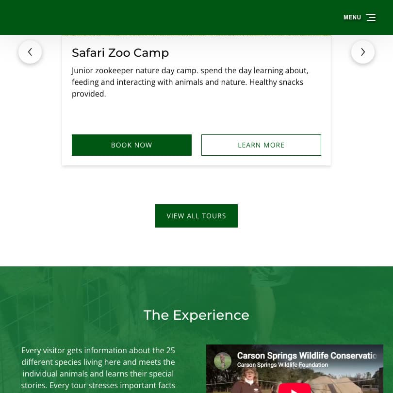
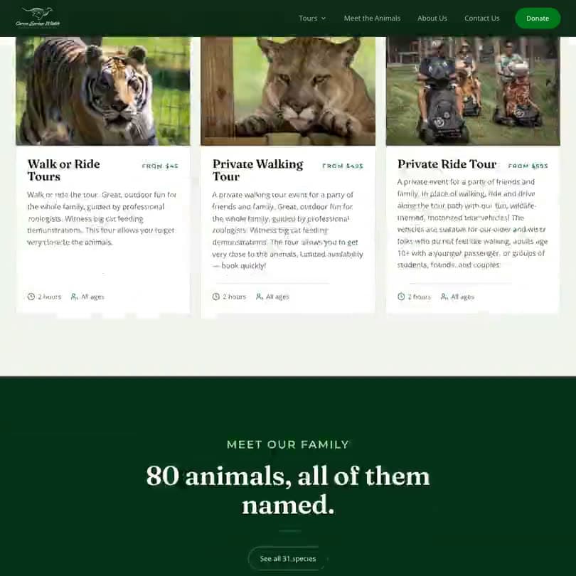
Tours
The same FareHarbor booking, reached in fewer steps and with each tour described by what it actually is rather than by its price first.
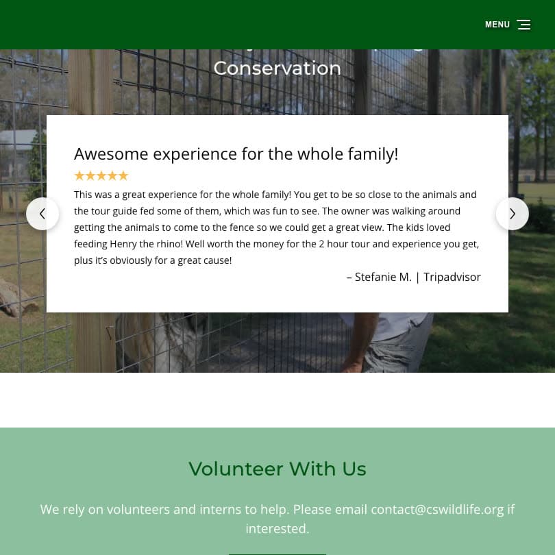
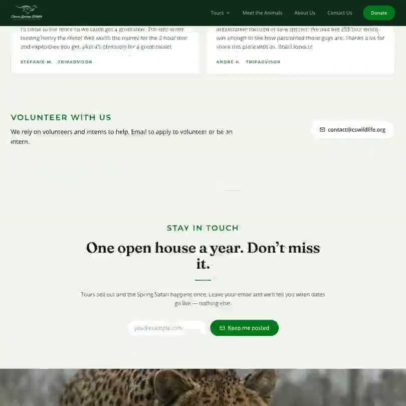
Conservation and volunteering
The parts that turn a visitor into a supporter — the conservation work, the volunteer route, the one open house a year — pulled up out of the footer and given room.
The decisions
Five calls that shaped the concept.
- 01
Say what it is not
The headline is Conservation. Not a zoo. Everything the sanctuary needs a visitor to understand follows from that one distinction, and it was the thing the previous site never said. A donor gives to a refuge; a ticket-buyer visits an attraction. The site has to know which conversation it is having.
- 02
Put the numbers where the claims are
275 acres, 100+ animals, 30 species, 100% of donations to animal care — directly under the headline. For a small charity the honesty of that last figure is the whole pitch, and burying it costs donations.
- 03
Tell the origin story properly
From horse farm to refuge, in the founders' own words, replacing the three generic icon columns. People give money to organisations they can picture. A story does that; an icon labelled Donations does not.
- 04
Keep FareHarbor, rebuild everything around it
Tour booking already ran on FareHarbor and stayed there. It holds the calendar, the payments and the waivers, and moving it would have been risk the sanctuary was not being paid to take. The concept improves the path to the booking rather than replacing the booking.
- 05
A donation flow of its own
Donations are handled directly through Stripe rather than a third-party donate button, so the amount, the framing and the follow-up all belong to the sanctuary. In this concept it runs in test mode and moves no money.
Want to see yours like this?
We will tell you what is wrong with the site you have now, whether you hire us or not.