Case study · Moving
ETG Moving & Delivery
A Miami-Dade moving company since 2015, with 351 reviews averaging 4.8 stars and a website that told Google it was a commercial cleaning business. We measured the old site before we drew a single screen of the new one. Everything below is what that measurement found, what we did about it, and the same numbers taken again afterwards.
- Client
- ETG Moving & Delivery
- Industry
- Moving & logistics
- Location
- Miami-Dade & Broward, FL
- Scope
- Audit · Website · Bilingual
The audit
We measured it before we redesigned it.
A redesign that starts with taste produces a site that is different. A redesign that starts with measurement produces a site that is better, and can prove which parts. So the first work on this project was not design at all — it was running the existing etgmoving.com through the same tools we would later use to grade our own, and writing down what came back.
Six findings mattered. None of them are matters of opinion, and every one can be checked against the live site today.

The first screen, before
This is the entire opening viewport of the old site at 1440×900. A stock photograph, a nav bar, and a button that says GET STARTED. There is no headline, no phone number, no service area, no price, no reason to pick this company over the next one. The first sentence of actual copy starts below the bottom edge of this image.
378
character description, for the wrong industry
Google was told they clean offices
The meta description — the sentence Google prints under the listing — was 378 characters about "Janitorial Services in Miami FL" and "premier commercial cleaning services". It is a leftover from a previous template that nobody ever replaced. Every person who found this moving company on Google was told it was a cleaning company before they clicked.
0
tappable phone links on a phone
The phone number was not a phone call
The number appears throughout the site as plain text. Rendered at a 390px phone viewport, the homepage contains zero tel: links. On the device where most movers are actually chosen, the primary action of the business could not be taken by tapping it.
0
forms on the entire homepage
There was no way to ask for a quote
No form, no fields, nothing to submit. A visitor who was ready to buy had to memorise a number, leave the site, open the dialler, and type it in — during business hours, in English.
1
language, in a bilingual county
The Spanish was a picture of Spanish
"Se Habla Español" was on the page as a 2,499-pixel-wide PNG with an empty alt attribute. A search engine cannot read it, a screen reader announces nothing, and the site behind it was entirely in English. The promise was real. It was just stored somewhere nothing could reach.
0
words of value proposition above the fold
The first screen made no argument
The opening viewport was a single stock photograph of a truck and a sofa. No headline, no reason to choose them, no phone number, no offer. The first actual sentence — "Since 2015 we have been…" — began below the fold, and the whole first screen asked the visitor for nothing.
8
third-party hosts on one page
Two H1s and a page builder
Two competing top-level headings, 44 script tags, 77 blocks of inline CSS, 8 third-party hosts, and 10 of 12 images with no alt text. Not one of those is a design decision. They are what a page builder leaves behind when nobody looks.
The decisions
Five calls, the reason behind each, and what each one measures.
Each decision below states the mechanism it is betting on before it states the number, because a number without a mechanism is a coincidence. The numbers are measurements of two live sites, not projections, and none of them describe a business outcome — see the limits at the bottom of this page for why.
- 01
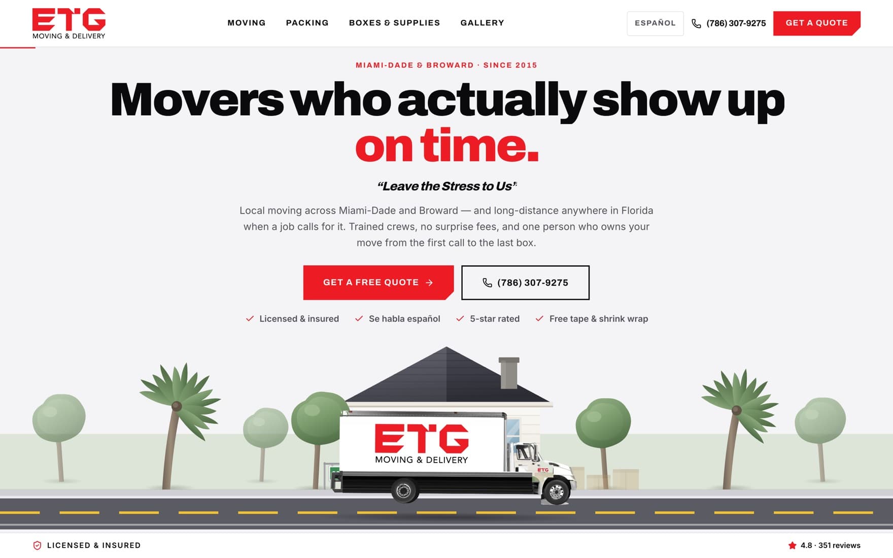
Make the first screen say what the business is and why it is the one
The problem
A visitor arriving on a mover's website is not browsing. They have a date, a lease, and a level of dread, and they are deciding in seconds whether this company is competent. The old first screen answered none of that: a stock truck, a nav bar and a button labelled GET STARTED, which starts nothing a visitor can picture.
What we did
The opening screen now carries a claim about the one thing movers are actually judged on — "Movers who actually show up on time" — their own painted tagline underneath it, the service area and year founded, two actions, and a four-item proof strip. The scene below it animates the truck arriving at a house and leaving loaded, which is the service rendered as a picture rather than described in a paragraph.
Why it works
The first screen is where a stranger decides whether to keep reading. Giving it a specific, falsifiable claim rather than a photograph gives them something to agree with.
- 11
- actions and links above the fold, from 8
- 1
- headline making a specific promise, from 0
- 02
Turn the phone number into a phone call
The problem
Moving is a high-anxiety, high-value, time-boxed purchase, and people want to talk to a person before they commit a household to a stranger. The old site made the number readable but not actionable — the single highest-intent action on the site required leaving it.
What we did
Every phone number on every page is a tel: link, including one in a sticky bar that follows the visitor down the page. The email address on the truck livery is on the site too. Nothing about the intent changed; the number of steps between wanting to call and calling went from four to one.
Why it works
Removing steps from an action the visitor already wants to take is the cheapest conversion work there is, and it compounds — every step in a chain is another chance to abandon it.
- 8
- tappable call links, from 0
- 1
- tap from anywhere to a call, from 4 steps
- 1
- four-step quote form, from no form at all
- 03
Make the Spanish actually be Spanish
The problem
ETG's trucks say they speak Spanish and their crews do. Their website said it in a JPEG. That is not a translation problem, it is a discoverability problem: nothing that indexes, reads or searches a page can see text stored as pixels, so the promise reached only the people who had already arrived and happened to scroll past it.
What we did
Every page exists twice, at /en and /es, written rather than machine-translated, with hreflang tags telling Google the two versions are the same page in different languages. The language switch is in the header on every page, and the choice persists.
Why it works
Reading a decision this consequential in your second language costs effort, and effort at the moment of choosing reads as friction. Matching the language is also a legitimacy signal: it says the business is of the place, not merely selling into it.
- 2
- languages, from 1
- 10
- indexable pages, from 7
- 2
- hreflang tags, from 0
- 04
Put the proof on the page instead of leaving it on the truck
The problem
ETG holds a US DOT number, an MC number and a Florida intrastate licence, and carries 351 reviews averaging 4.8 stars across four platforms. None of it appeared on their website. Meanwhile the fear a mover has to defeat is specific and well known — that the company is unlicensed, uninsured, or will not turn up.
What we did
US DOT 2805350, MC 103838 and Florida IM 2567 are printed in the hero strip and the footer, and encoded in structured data. The review average and count are on the page and marked up as an aggregate rating. The published reviews are genuine platform quotes, labelled by platform, with no invented names attached to them.
Why it works
Licence numbers work as proof precisely because they are checkable — a number a visitor could verify carries weight a claim never does. Volume of reviews does work the average alone cannot: 4.8 from 351 people reads as a business that has been doing this for years.
- 3
- licence numbers published, from 0
- 10
- structured-data types, from 3
- 351
- reviews now visible, from 0
- 05
Get the page builder out from between the visitor and the business
The problem
The old homepage shipped 1.64 MB and 61 requests across 8 hosts, of which 848 KB was JavaScript, to render what is essentially text, photographs and a phone number. It held the phone busy for nearly two seconds of blocking work and did not become reliably interactive for twelve.
What we did
Statically rendered pages, no page builder, imagery sized to the layout, and the third-party stack cut to what the site actually uses. Nothing was removed from the content; the machinery around it was.
Why it works
Google classifies a Largest Contentful Paint over 4.0 seconds as poor and 2.5 seconds or under as good. The old site sat between those, on a category of purchase people research standing in a half-packed apartment on cellular data.
- -55%
- page weight, 1.64 MB to 742 KB
- -73%
- JavaScript, 848 KB to 229 KB
- -60%
- blocking time, 1,934 ms to 767 ms
- -52%
- time to interactive, 12.0s to 5.7s
Before and after
Twenty-six measurements, both sites, same day.
Lighthouse 13, mobile form factor, simulated throttling, homepage only. Performance rows are the median of three warm runs per site rather than a single pass — our first run against the new build returned a 5.14 second paint because it hit a cold start, and one run would have published that as a fact.
| Measurement | Squarespace | Ninewave |
|---|---|---|
| Performance score | 53 | 71 |
| SEO score | 92 | 100 |
| Accessibility score | 96 | 96 |
| Best practices score | 100 | 100 |
| Largest Contentful Paint | 3.57s | 3.05s |
| Speed Index | 4.50s | 3.14s |
| Total Blocking Time | 1,934ms | 767ms |
| Cumulative Layout Shift | 0.012 | 0.002 |
| Time to Interactive | 11.98s | 5.74s |
| Page weight | 1,644 KB | 742 KB |
| JavaScript | 848 KB | 229 KB |
| CSS | 159 KB | 13 KB |
| Images | 472 KB | 213 KB |
| Network requests | 61 | 42 |
| Third-party hosts | 8 | 2 |
| Script tags in the HTML | 44 | 13 |
| Inline style blocks | 77 | 0 |
| Meta description length | 378 | 211 |
| H1 elements | 2 | 1 |
| Structured-data types | 3 | 10 |
| Security headers | 3 / 6 | 6 / 6 |
| Languages | 1 | 2 |
| Indexable pages | 7 | 10 |
| Tappable phone links | 0 | 8 |
| Quote forms | 0 | 1 |
| Images missing alt text | 10 of 12 | 3 of 22 |
Measured 27–28 August 2026. Metadata, structured data and security headers read from the served HTML and response headers. Link, form and heading counts taken from the rendered DOM at a 390px viewport.
The limits
What this case study does not prove.
There are no leads, calls, bookings or revenue figures on this page, and their absence is the honest part. The rebuild is a preview deployment: etgmoving.com still serves the old site, no domain has been cut over, and so no business outcome has happened yet, never mind been measured. Every number above describes the website. None of them describes the company's results, and we will not publish one until there is a real one to publish.
Lighthouse also varies between runs, which is why the performance rows are medians of three. And a homepage is not a whole site.
Still open on our side
- The new meta description is 211 characters. That is a great deal better than 378 characters about a cleaning company, but Google still truncates it around 160 and it should be rewritten.
- The new site does not serve a sitemap.xml — the route 404s. The old Squarespace site does serve one. This is a regression and it is ours.
- Three of twenty-two images still have no alt text.
- The quote form is not delivering yet. Until a Resend key is set in Vercel it records the lead and reports success without emailing anyone.
This page argues that the old site was never audited before it was designed. Publishing it without listing what is still wrong with ours would make that argument and lose it in the same breath.
In short
A good moving company that its own website was arguing against.
The description Google showed searchers now describes moving, not commercial cleaning.
The phone number is a phone call from anywhere on the site, and there is a quote form behind it.
The Spanish is written Spanish on ten indexable pages, not a picture with an empty alt attribute.
Three licence numbers and 351 real reviews are on the page and in the structured data.
The homepage is 55% lighter, blocks the phone for 60% less time, and becomes usable in half the time.
Everything above can be re-measured against both live sites in about five minutes.
Want to know what your site measures?
The audit above is the same one every build starts with, and we will run it on your site whether or not you hire us.